Compass

Component Palette Icon:
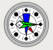
The compass is a component that displays up to three needles at once on a cardinal direction compass. This can be useful for plotting anything that has a cardinal direction, such as the wind direction.
Each needle can be one of 9 different styles. Use the "Disabled" style to turn off any needle.
|
Name |
Description |
Property Type |
Scripting |
Category |
|
Border |
The border surrounding this component. NOTE that the border is unaffected by rotation. |
Border |
.border |
Common |
|
Center Color |
The center color of the compass |
Color |
.centerColor |
Appearance |
|
Cursor |
The mouse cursor to use when hovering over this component. |
int |
.cursorCode |
Common |
|
Data Quality |
The data quality code for any tag bindings on this component. |
int |
.dataQuality |
Data |
|
Label Font |
The font to use for the compass's labels. |
Font |
.labelFont |
Appearance |
|
Mouseover Text |
The text that is displayed in the tooltip which pops up on mouseover of this component. |
String |
.toolTipText |
Common |
|
Name |
The name of this component. |
String |
.name |
Common |
|
Rose Color |
The background color of the rose. |
Color |
.roseColor |
Appearance |
|
Rose Highlight |
The highlight color of the rose. |
Color |
.roseHighlightColor |
Appearance |
|
Styles |
Contains the component's styles |
Dataset |
.styles |
Appearance |
|
Value 1 |
Value 1 for the compass. |
double |
.value1 |
Data |
|
Value 1 Color |
The main color for Value 1's needle |
Color |
.value1Color |
Appearance |
|
Value 1 Needle |
The needle type for this value. |
int |
.value1Needle |
Data |
|
Value 1 Outline |
The outline color for value 1s needle |
Color |
.value1OutlineColor |
Appearance |
|
Value 2 |
Value 2 for the compass. |
double |
.value2 |
Data |
|
Value 2 Color |
The main color for Value 2's needle |
Color |
.value2Color |
Appearance |
|
Value 2 Needle |
The needle type for this value. |
int |
.value2Needle |
Data |
|
Value 2 Outline |
The outline color for value 2s needle |
Color |
.value2OutlineColor |
Appearance |
|
Value 3 |
Value 3 for the compass. |
double |
.value3 |
Data |
|
Value 3 Color |
The main color for Value 3's needle |
Color |
.value3Color |
Appearance |
|
Value 3 Needle |
The needle type for this value. |
int |
.value3Needle |
Data |
|
Value 3 Outline |
The outline color for value 3s needle |
Color |
.value3OutlineColor |
Appearance |
|
Visible |
If disabled, the component will be hidden. |
boolean |
.visible |
Common |
This component does not have scripting functions associated with it. Remove the panel below if there are no scripting functions.
This component does not have scripting functions associated with it.
mouse
mouseClicked
This event signifies a mouse click on the source component. A mouse click the combination of a mouse press and a mouse release, both of which must have occurred over the source component. Note that this event fires after the pressed and released events have fired.
|
Property |
Description |
|
source |
The component that fired this event |
|
button |
The code for the button that coused this event to fire. |
|
clickCount |
The number of mouse clicks associated with this event. |
|
x |
The x-coordinate (with respect to the source component) of this mouse event. |
|
y |
The y-coordinate (with respect to the source component) of this mouse event. |
|
popupTrigger |
Returns True (1) if this mouse event is a popup trigger. What constitutes a popup trigger is operating system dependent, which is why this abstraction exists. |
|
altDown |
True (1) if the Alt key was held down during this event, false (0) otherwise. |
|
controlDown |
True (1) if the Control key was held down during this event, false (0) otherwise. |
|
shiftDown |
True (1) if the Shift key was held down during this event, false (0) otherwise. |
mouseEntered
This event fires when the mouse enters the space over the source component.
|
Property |
Description |
|
source |
The component that fired this event |
|
button |
The code for the button that coused this event to fire. |
|
clickCount |
The number of mouse clicks associated with this event. |
|
x |
The x-coordinate (with respect to the source component) of this mouse event. |
|
y |
The y-coordinate (with respect to the source component) of this mouse event. |
|
popupTrigger |
Returns True (1) if this mouse event is a popup trigger. What constitutes a popup trigger is operating system dependent, which is why this abstraction exists. |
|
altDown |
True (1) if the Alt key was held down during this event, false (0) otherwise. |
|
controlDown |
True (1) if the Control key was held down during this event, false (0) otherwise. |
|
shiftDown |
True (1) if the Shift key was held down during this event, false (0) otherwise. |
mouseExited
This event fires when the mouse leaves the space over the source component.
|
Property |
Description |
|
source |
The component that fired this event |
|
button |
The code for the button that coused this event to fire. |
|
clickCount |
The number of mouse clicks associated with this event. |
|
x |
The x-coordinate (with respect to the source component) of this mouse event. |
|
y |
The y-coordinate (with respect to the source component) of this mouse event. |
|
popupTrigger |
Returns True (1) if this mouse event is a popup trigger. What constitutes a popup trigger is operating system dependent, which is why this abstraction exists. |
|
altDown |
True (1) if the Alt key was held down during this event, false (0) otherwise. |
|
controlDown |
True (1) if the Control key was held down during this event, false (0) otherwise. |
|
shiftDown |
True (1) if the Shift key was held down during this event, false (0) otherwise. |
mousePressed
This event fires when a mouse button is pressed down on the source component.
|
Property |
Description |
|
source |
The component that fired this event |
|
button |
The code for the button that coused this event to fire. |
|
clickCount |
The number of mouse clicks associated with this event. |
|
x |
The x-coordinate (with respect to the source component) of this mouse event. |
|
y |
The y-coordinate (with respect to the source component) of this mouse event. |
|
popupTrigger |
Returns True (1) if this mouse event is a popup trigger. What constitutes a popup trigger is operating system dependent, which is why this abstraction exists. |
|
altDown |
True (1) if the Alt key was held down during this event, false (0) otherwise. |
|
controlDown |
True (1) if the Control key was held down during this event, false (0) otherwise. |
|
shiftDown |
True (1) if the Shift key was held down during this event, false (0) otherwise. |
mouseReleased
This event fires when a mouse button is released, if that mouse button's press happened over this component.
|
Property |
Description |
|
source |
The component that fired this event |
|
button |
The code for the button that coused this event to fire. |
|
clickCount |
The number of mouse clicks associated with this event. |
|
x |
The x-coordinate (with respect to the source component) of this mouse event. |
|
y |
The y-coordinate (with respect to the source component) of this mouse event. |
|
popupTrigger |
Returns True (1) if this mouse event is a popup trigger. What constitutes a popup trigger is operating system dependent, which is why this abstraction exists. |
|
altDown |
True (1) if the Alt key was held down during this event, false (0) otherwise. |
|
controlDown |
True (1) if the Control key was held down during this event, false (0) otherwise. |
|
shiftDown |
True (1) if the Shift key was held down during this event, false (0) otherwise. |
mouseMotion
mouseDragged
Fires when the mouse moves over a component after a button has been pushed.
|
Property |
Description |
|
source |
The component that fired this event |
|
button |
The code for the button that coused this event to fire. |
|
clickCount |
The number of mouse clicks associated with this event. |
|
x |
The x-coordinate (with respect to the source component) of this mouse event. |
|
y |
The y-coordinate (with respect to the source component) of this mouse event. |
|
popupTrigger |
Returns True (1) if this mouse event is a popup trigger. What constitutes a popup trigger is operating system dependent, which is why this abstraction exists. |
|
altDown |
True (1) if the Alt key was held down during this event, false (0) otherwise. |
|
controlDown |
True (1) if the Control key was held down during this event, false (0) otherwise. |
|
shiftDown |
True (1) if the Shift key was held down during this event, false (0) otherwise. |
mouseMoved
Fires when the mouse moves over a component, but no buttons are pushed.
|
Property |
Description |
|
source |
The component that fired this event |
|
button |
The code for the button that coused this event to fire. |
|
clickCount |
The number of mouse clicks associated with this event. |
|
x |
The x-coordinate (with respect to the source component) of this mouse event. |
|
y |
The y-coordinate (with respect to the source component) of this mouse event. |
|
popupTrigger |
Returns True (1) if this mouse event is a popup trigger. What constitutes a popup trigger is operating system dependent, which is why this abstraction exists. |
|
altDown |
True (1) if the Alt key was held down during this event, false (0) otherwise. |
|
controlDown |
True (1) if the Control key was held down during this event, false (0) otherwise. |
|
shiftDown |
True (1) if the Shift key was held down during this event, false (0) otherwise. |
propertyChange
propertyChange
Fires whenever a bindable property of the source component changes. This works for standard and custom (dynamic) properties.
|
Property |
Description |
|
source |
The component that fired this event |
|
newValue |
The new value that this property changed to. |
|
oldValue |
The value that this property was before it changed. Note that not all components include an accurate oldValue in their events. |
|
propertyName |
The name of the property that changed. NOTE: remember to always filter out these events for the property that you are looking for! Components often have many properties that change. |
This component does not have any custom properties.
|
Property Name |
Value |
|
Value 1 |
140 |
|
Value 1 Needle |
Arrow |
|
Value 2 |
90 |
|
Value 2 Needle |
Long |
|
Value 3 |
180 |
|
Value 3 Needle |
Plum |