Component Layout
Layout is the concept that a component's size and position, relative to its parent container's size and position, can be dynamic. This allows the creation of windows that resize gracefully using either Anchored or Relative layouts and can optionally keep the original aspect ratio.
This is a very important concept because of the web-launched deployment of Vision clients - they often end up being launched on many different monitors with many different resolutions.
This is also important for components that have user-adjustable windows like popup windows. Imagine a popup window that is mostly displaying a large table or chart. If you're running on a large monitor, you may want to make the window bigger to see the table or chart easier. Of course, this is only useful if the table or chart actually gets larger with the window.
Changing a component's layout is as simple as right-clicking on the component and opening the Layout dialog box. You can also alter the default layout mode that gets assigned to new components. See Designer/Window Editing Properties.
Relative vs Anchored Layout
There are two layout modes, and they are set on a per-component basis. Both affect the component's size and position relative to its parent container. The root container's size is dictated by the window size. To edit the layout of a component, right-click on the component and select Layout from the menu. the Layout Constraints window displays showing all the default settings. These default settings can be altered in the Project Properties.
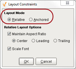
Layout Modes
-
Relative
This mode makes a component's size and location relative to its parent's size and location. When the parent changes size, the component changes accordingly. This creates components that auto-scale. -
Anchored
This mode makes the edge of a component's two axes (horizontal and vertical) anchored to the edge or edges of its parent.
Relative Layout
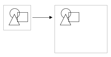
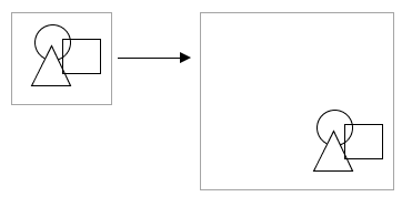
Relative layout is the default mode. This is a simple and effective layout mode that simply keeps a component's size and position constant relative to its parent container, even when the parent container grows or shrinks. More precisely, it remembers the component's position and size as a percentage of its parent's bounds at the last time the window was saved. Relative layout also has the option of scaling a component's font appropriately.
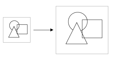
Example of Relative Layout
Note that relative layout mode respects aspect ratio. So if the parent component is distorted, the contents will not be. The extra space is distributed evenly on both sides of the contents.
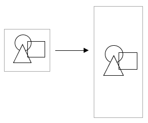
Relative layout preserves aspect ratio
Relative Layout Options
-
Maintain Aspect Ratio
If selected, the component's original aspect ratio is preserved. Otherwise, it can stretch tall or wide. -
Center
When maintaining the aspect ratio, centers the component with respect to its parent. -
Leading
When maintaining the aspect ratio, aligns the component with the paper leading edge. -
Trailing
When maintaining the aspect ratio, aligns the component with the parent's trailing edge. -
Scale Font
If selected, the component's font will scale along with its size as the relative layout adjusts the component.
Anchored Layout
Anchored layout lets you specify various "anchors" for the component. The anchors dictate how far each of the 4 edges of the component stay from their corresponding edges in the parent container. For example, if you anchor top and left, then your component will stay a constant distance from top and left edges of its parent. Since you didn't specify an anchor for the right or bottom sides, they won't be affected by the layout.
Components anchored top and left
If you anchor bottom and right instead, the components will again stay the same size (since you didn't specify an anchor for their other edges, but they will stay a constant distance from their parent's right and bottom edges.
Components anchored bottom and right
Anchored Layout Options
-
North/South
If one of these is selected, the distance between that edge of the component and that edge of the container is preserved. If both are selected, the component will stretch its height to maintain both distances. -
West/East
If one of these is selected, the distance between that edge of the component and that edge of the container is preserved. If both are selected, the component will stretch its width to maintain both distances. -
Center Vertically
When selected, both top and bottom buttons will be deselected. This option maintains the height of the component and centers it vertically in the container. -
Center Horizontally
When selected, both left and right buttons will be deselected. This option maintains the width of the component and centers it horizontally in the container.
Of course, you can mix and match the various modes for the different components in a given container. The following image shows the following:
-
The square uses a horizontal and vertical centering anchor. It is centered, and stays the same size.
-
The triangle is anchored south and west.
-
The circle is anchored north, west, south, and east. This means that its edges are all anchored and stay a fixed distance to each of its parent's edges, so it grows.
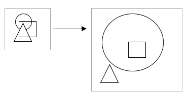
Components with various anchoring modes
Client Minimum Size
Clients can define a minimum size, because even with dynamic layout, you usually don't want the client to get too small. This is because it would become unusable and unreadable. This is what the Minimum Size property is for. By default it is set to 800x600, but you can adjust it. For more information, see Client/User Interface Properties.