Month View
Component Palette Icon:
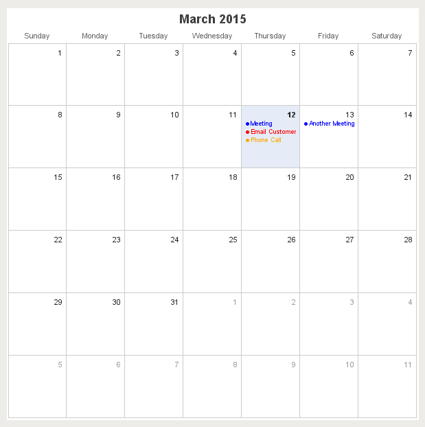
The component's properties are populated from a sql query. The following properties are from the Alarm Status Table. Change this to the correct component.
|
Name |
Description |
Property Type |
Scripting |
Category |
|
Border |
The border surrounding this component. NOTE that the border is unaffected by rotation. |
Border |
.border |
Common |
|
Calendar Background Color |
The color of the calendar's background. |
Color |
.calendarBackground |
Appearance |
|
Calendar events |
Contains the calendar events |
Dataset |
.events |
Data |
|
Cursor |
The mouse cursor to use when hovering over this component. |
int |
.cursorCode |
Common |
|
Data Quality |
The data quality code for any tag bindings on this component. |
int |
.dataQuality |
Data |
|
Day Font |
The font for the number representing the day of the month. |
Font |
.dayFont |
Appearance |
|
Day Foreground Color |
The foreground color for days in this month |
Color |
.dayOfMonthForeground |
Appearance |
|
Day Other Foreground Color |
The foreground color for days not in this month |
Color |
.dayOfMonthOtherForeground |
Appearance |
|
Day Outline Color |
The color of the day's outline |
Color |
.boxOutline |
Appearance |
|
Event Background Color |
The background color of the selected event |
Color |
.itemSelBackground |
Appearance |
|
Event Display Mode |
<HTML>Affects how events are displayed.<UL><LI><B>Standard Mode: </B>Displays each event</LI><LI><B>Highlight Mode: </B>Highlights each day that contains events using the event highlight background color.</LI></UL> |
int |
.displayMode |
Appearance |
|
Event Font |
The font for all calendar events. |
Font |
.eventFont |
Appearance |
|
Event Highlight Background |
The background color of a day with events. Used only in highlight mode. |
Color |
.highlightBackground |
Appearance |
|
Header Background Color |
The color of the header's background |
Color |
.monthHeaderBackground |
Appearance |
|
Header Font |
The font of the header's text. |
Font |
.headerFont |
Appearance |
|
Header Foreground Color |
The color of the header's text. |
Color |
.monthHeaderForeground |
Appearance |
|
Hover Background Color |
The background color of the hovered day |
Color |
.hoverBackground |
Appearance |
|
Hovered Day |
The calendar's hovered day |
String |
.hoveredDay |
Data |
|
Month |
Set the calendar's month |
int |
.month |
Data |
|
Mouseover Text |
The text that is displayed in the tooltip which pops up on mouseover of this component. |
String |
.toolTipText |
Common |
|
Name |
The name of this component. |
String |
.name |
Common |
|
Selected Background Color |
The color of the selected day's background |
Color |
.selectedBackground |
Appearance |
|
Selected Day |
The calendar's selected day |
String |
.selectedDay |
Data |
|
Selected Event |
The calendar's selected event |
int |
.selectedEvent |
Data |
|
Styles |
Contains the component's styles |
Dataset |
.styles |
Appearance |
|
Today's Background Color |
The color of the today's background |
Color |
.todayBackground |
Appearance |
|
Visible |
If disabled, the component will be hidden. |
boolean |
.visible |
Common |
|
Week Day Background Color |
The color of the week day's background |
Color |
.weekDaysBackground |
Appearance |
|
Week Day Font |
The font of the week day's text. |
Font |
.weekdayFont |
Appearance |
|
Week Day Foreground Color |
The color of the week day's text. |
Color |
.weekDaysForeground |
Appearance |
|
Year |
Set the calendar's year |
int |
.year |
Data |
This component does not have scripting functions associated with it.
This component does not have scripting functions associated with it.
mouse
mouseClicked
This event signifies a mouse click on the source component. A mouse click the combination of a mouse press and a mouse release, both of which must have occurred over the source component. Note that this event fires after the pressed and released events have fired.
|
Property |
Description |
|
source |
The component that fired this event |
|
button |
The code for the button that coused this event to fire. |
|
clickCount |
The number of mouse clicks associated with this event. |
|
x |
The x-coordinate (with respect to the source component) of this mouse event. |
|
y |
The y-coordinate (with respect to the source component) of this mouse event. |
|
popupTrigger |
Returns True (1) if this mouse event is a popup trigger. What constitutes a popup trigger is operating system dependent, which is why this abstraction exists. |
|
altDown |
True (1) if the Alt key was held down during this event, false (0) otherwise. |
|
controlDown |
True (1) if the Control key was held down during this event, false (0) otherwise. |
|
shiftDown |
True (1) if the Shift key was held down during this event, false (0) otherwise. |
mouseEntered
This event fires when the mouse enters the space over the source component.
|
Property |
Description |
|
source |
The component that fired this event |
|
button |
The code for the button that coused this event to fire. |
|
clickCount |
The number of mouse clicks associated with this event. |
|
x |
The x-coordinate (with respect to the source component) of this mouse event. |
|
y |
The y-coordinate (with respect to the source component) of this mouse event. |
|
popupTrigger |
Returns True (1) if this mouse event is a popup trigger. What constitutes a popup trigger is operating system dependent, which is why this abstraction exists. |
|
altDown |
True (1) if the Alt key was held down during this event, false (0) otherwise. |
|
controlDown |
True (1) if the Control key was held down during this event, false (0) otherwise. |
|
shiftDown |
True (1) if the Shift key was held down during this event, false (0) otherwise. |
mouseExited
This event fires when the mouse leaves the space over the source component.
|
Property |
Description |
|
source |
The component that fired this event |
|
button |
The code for the button that coused this event to fire. |
|
clickCount |
The number of mouse clicks associated with this event. |
|
x |
The x-coordinate (with respect to the source component) of this mouse event. |
|
y |
The y-coordinate (with respect to the source component) of this mouse event. |
|
popupTrigger |
Returns True (1) if this mouse event is a popup trigger. What constitutes a popup trigger is operating system dependent, which is why this abstraction exists. |
|
altDown |
True (1) if the Alt key was held down during this event, false (0) otherwise. |
|
controlDown |
True (1) if the Control key was held down during this event, false (0) otherwise. |
|
shiftDown |
True (1) if the Shift key was held down during this event, false (0) otherwise. |
mousePressed
This event fires when a mouse button is pressed down on the source component.
|
Property |
Description |
|
source |
The component that fired this event |
|
button |
The code for the button that coused this event to fire. |
|
clickCount |
The number of mouse clicks associated with this event. |
|
x |
The x-coordinate (with respect to the source component) of this mouse event. |
|
y |
The y-coordinate (with respect to the source component) of this mouse event. |
|
popupTrigger |
Returns True (1) if this mouse event is a popup trigger. What constitutes a popup trigger is operating system dependent, which is why this abstraction exists. |
|
altDown |
True (1) if the Alt key was held down during this event, false (0) otherwise. |
|
controlDown |
True (1) if the Control key was held down during this event, false (0) otherwise. |
|
shiftDown |
True (1) if the Shift key was held down during this event, false (0) otherwise. |
mouseReleased
This event fires when a mouse button is released, if that mouse button's press happened over this component.
|
Property |
Description |
|
source |
The component that fired this event |
|
button |
The code for the button that coused this event to fire. |
|
clickCount |
The number of mouse clicks associated with this event. |
|
x |
The x-coordinate (with respect to the source component) of this mouse event. |
|
y |
The y-coordinate (with respect to the source component) of this mouse event. |
|
popupTrigger |
Returns True (1) if this mouse event is a popup trigger. What constitutes a popup trigger is operating system dependent, which is why this abstraction exists. |
|
altDown |
True (1) if the Alt key was held down during this event, false (0) otherwise. |
|
controlDown |
True (1) if the Control key was held down during this event, false (0) otherwise. |
|
shiftDown |
True (1) if the Shift key was held down during this event, false (0) otherwise. |
mouseMotion
mouseDragged
Fires when the mouse moves over a component after a button has been pushed.
|
Property |
Description |
|
source |
The component that fired this event |
|
button |
The code for the button that coused this event to fire. |
|
clickCount |
The number of mouse clicks associated with this event. |
|
x |
The x-coordinate (with respect to the source component) of this mouse event. |
|
y |
The y-coordinate (with respect to the source component) of this mouse event. |
|
popupTrigger |
Returns True (1) if this mouse event is a popup trigger. What constitutes a popup trigger is operating system dependent, which is why this abstraction exists. |
|
altDown |
True (1) if the Alt key was held down during this event, false (0) otherwise. |
|
controlDown |
True (1) if the Control key was held down during this event, false (0) otherwise. |
|
shiftDown |
True (1) if the Shift key was held down during this event, false (0) otherwise. |
mouseMoved
Fires when the mouse moves over a component, but no buttons are pushed.
|
Property |
Description |
|
source |
The component that fired this event |
|
button |
The code for the button that coused this event to fire. |
|
clickCount |
The number of mouse clicks associated with this event. |
|
x |
The x-coordinate (with respect to the source component) of this mouse event. |
|
y |
The y-coordinate (with respect to the source component) of this mouse event. |
|
popupTrigger |
Returns True (1) if this mouse event is a popup trigger. What constitutes a popup trigger is operating system dependent, which is why this abstraction exists. |
|
altDown |
True (1) if the Alt key was held down during this event, false (0) otherwise. |
|
controlDown |
True (1) if the Control key was held down during this event, false (0) otherwise. |
|
shiftDown |
True (1) if the Shift key was held down during this event, false (0) otherwise. |
propertyChange
propertyChange
Fires whenever a bindable property of the source component changes. This works for standard and custom (dynamic) properties.
|
Property |
Description |
|
source |
The component that fired this event |
|
newValue |
The new value that this property changed to. |
|
oldValue |
The value that this property was before it changed. Note that not all components include an accurate oldValue in their events. |
|
propertyName |
The name of the property that changed. NOTE: remember to always filter out these events for the property that you are looking for! Components often have many properties that change. |
This component does not have any custom properties.
There are no examples associated with this component.